![Facebook New Design [2020] Rolled Out to ALL Desktop Users](https://toggloid.com/wp-content/uploads/2020/02/facebook-new-look.png)
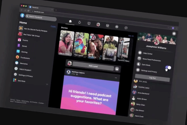
FACEBOOK’s new desktop redesign is being rolled out to all desktop users. Facebook had made an announcement about its redesign plans way back in April 2019, and finally update is here.
Key highlights of Facebook’s new design is minimalist design. And its website is all white as blue is gone. The top banner is also in white with light grey Notifications, News Feed, Messenger, etc, icons.
The company’s logo has been redesigned too. Unlike a square, it now features a blue circle with a white ‘F’ in it. The social media giant’s motive behind design revamp is simple: make Facebook easier to use, add a dark mode feature.
‘Facebook Redesign,’ new features to expect
- The design comes with rounded corners. As compared to the current Facebook design, this new design is colorful.
- Text is large or at least it appears so. There’s more white space. Therefore, less content appears on the screen.
- The new design of Facebook features light and dark mode. Users can switch between the two accordingly.
- The new design is responsive. That’s to say, the content realigns and resizes according to screen size.
- The icon bar offers quick access to various features such as videos, homepage, groups, marketplace, gaming, etc.
- The new design supports a two-column and three-column viewing for small and large width browsers, respectively.
![Facebook New Design [2020]](http://toggloid.com/wp-content/uploads/2020/02/facebook-new-look.png)
Facebook New Design [2020]

Facebook New Design [2020] – Dark Mode
If Facebook hasn’t yet invited you to try its new desktop redesign, rest assured to get it in the coming weeks. It’s still being rolled out to all users. In the meantime, you can refer to our earlier blog titled, Ecommerce Design Trends [2020] where we had presciently written about minimalism, dark mode, content-centric design emerging as the latest design trends of 2020.


